CACU Design Refresh
A brand refresh to build online engagement
I worked with Sixo.one and their client Community America Credit Union to refresh their brand and bring life to new financial products.
Existing evergreen brand guidelines were ideal for print and retail but lacked depth for digital channels.
Role
Creative consultant, Lead brand designer
Delivered
Collaborative client workshop, two unique visual directions, design system guidance
Design approach
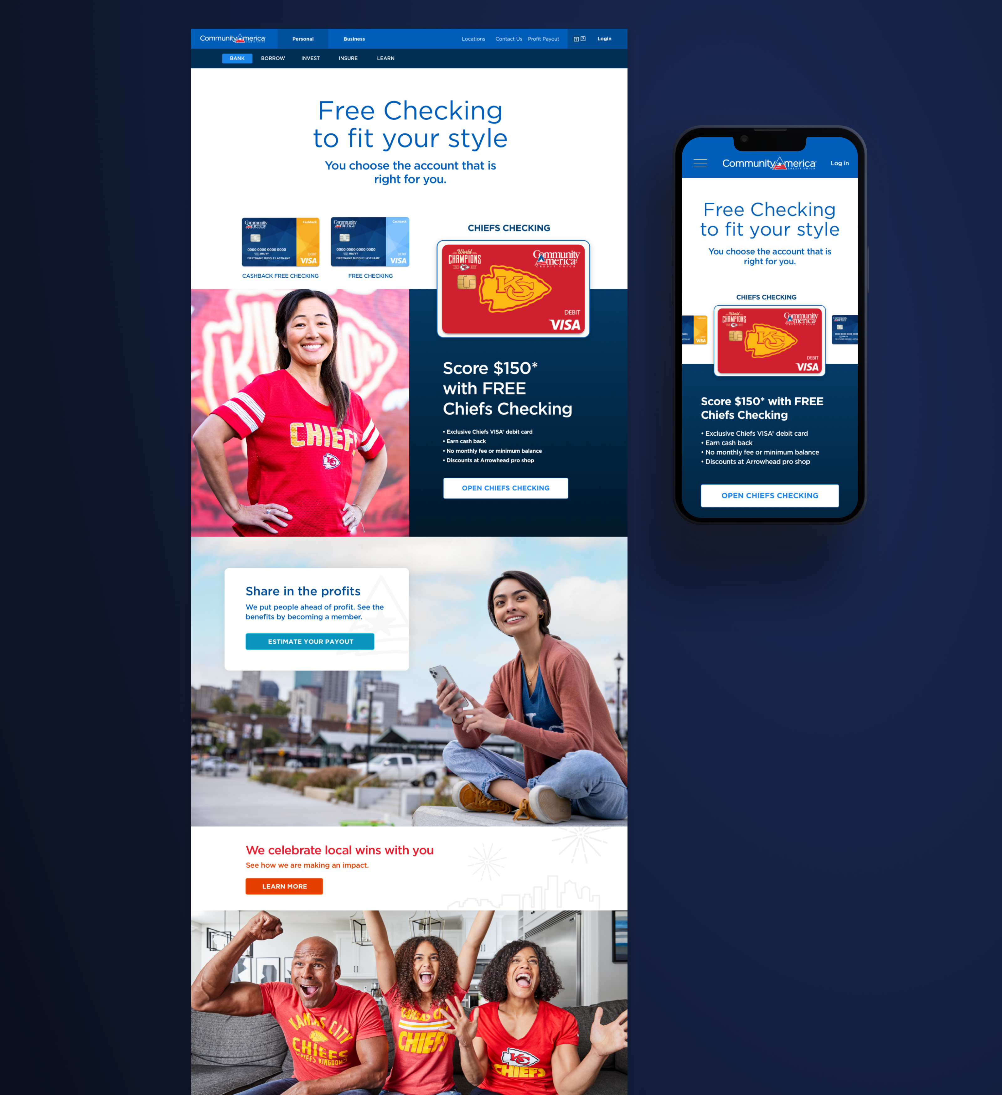
The brand guidelines are the foundation – color palette, typeface, and visual system should extend to be more dynamic for digital channels
Use visuals instead of text – a chart, diagram, photo or graphic can be used to communicate the same ideas as paragraph text.
Leverage interactive elements to encourage a customer to take actions towards becoming a member.
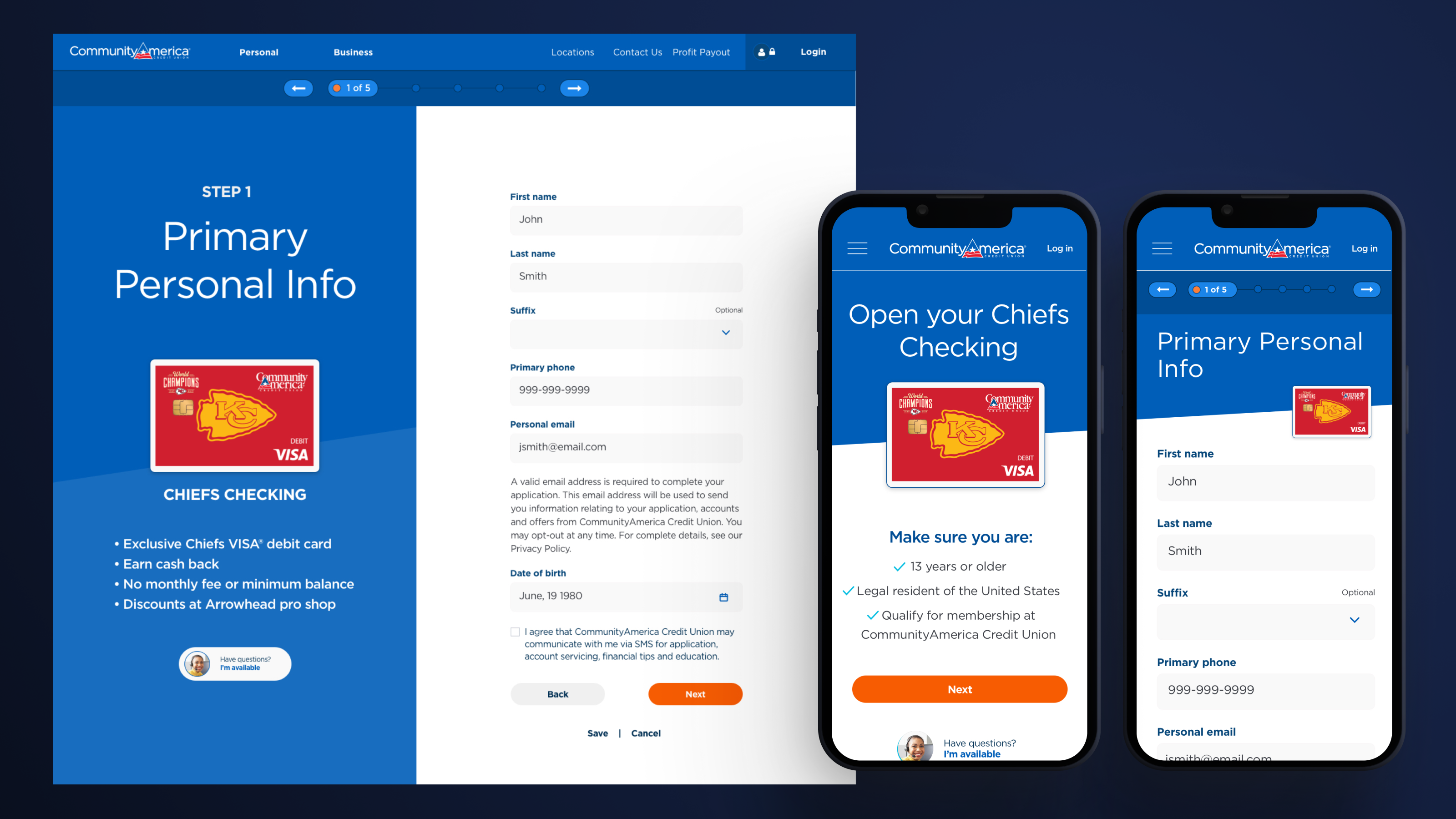
Not just visually enhanced, but also highly usable
A key part to the project was to address the user experience in key areas: Landing page conversion, Onboarding flows, interactive elements that engage more members
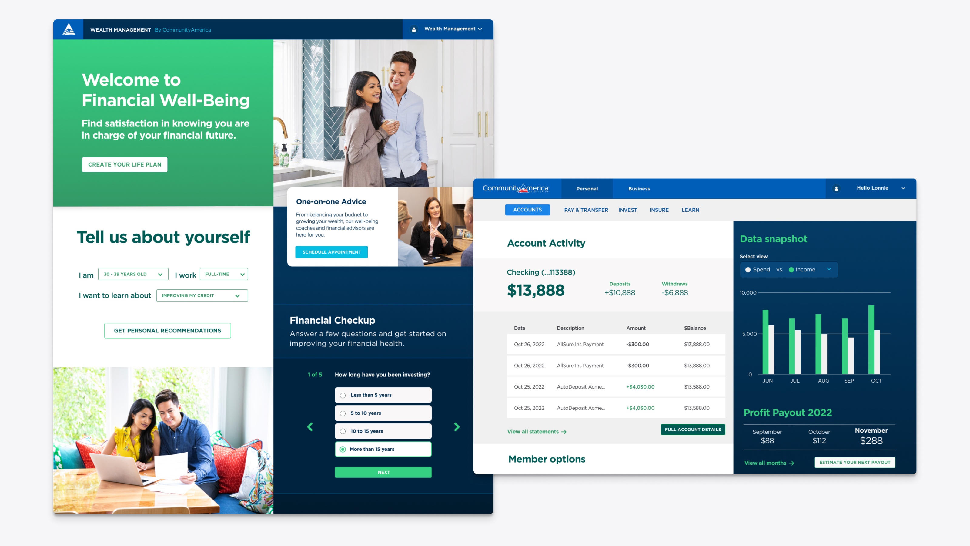
Extending the refresh to other product families
The brand refresh extended beyond the website to investment tools and member banking experiences. It was important to find the balance between creating a consistent visual design and differentiating the unique products.
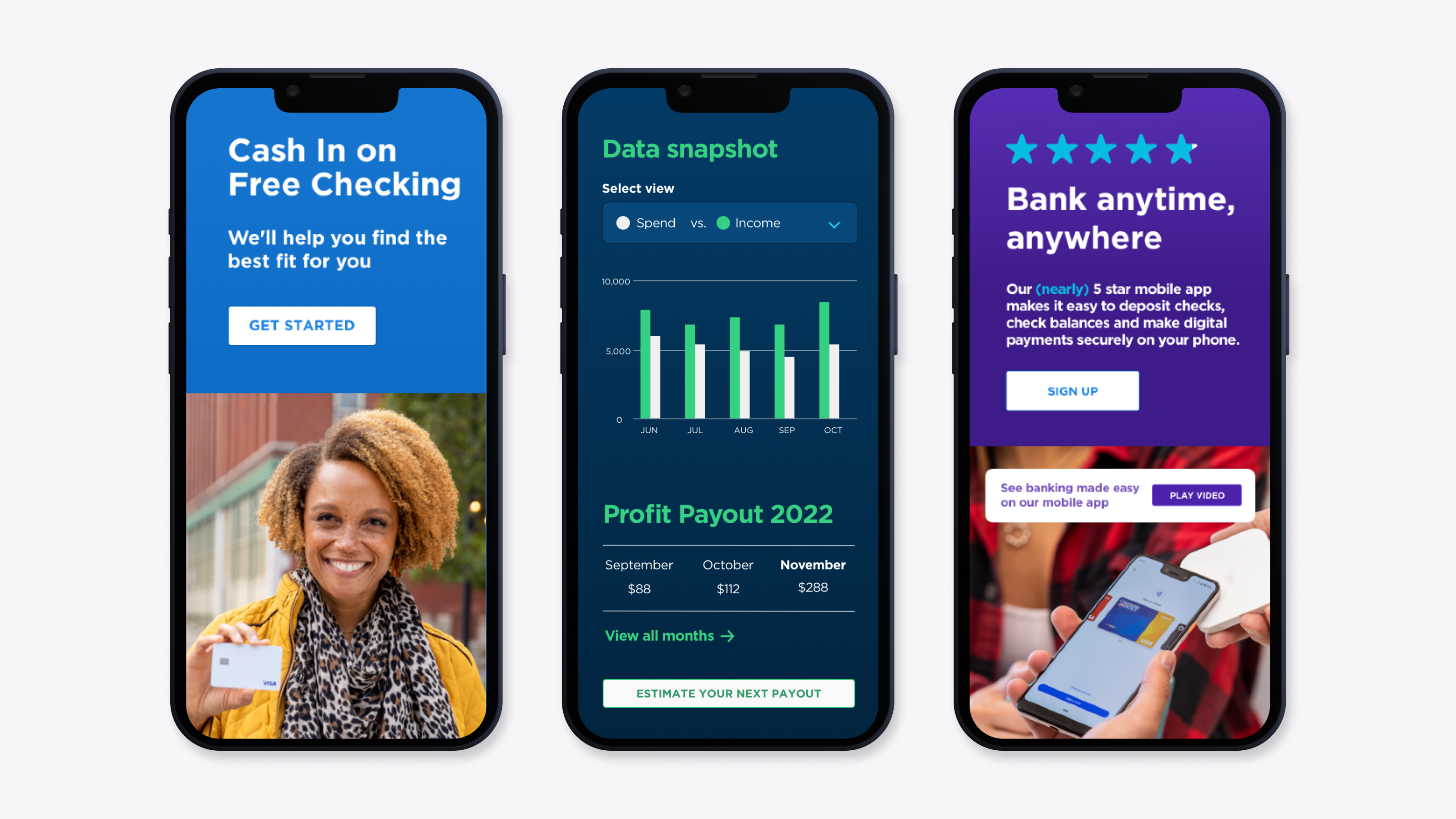
Color infusion
One of the most successful aspects of the refresh was injecting richer colors and generally more color everywhere.
The photography set a great tone and was the influence behind brightening and enriching the banking experience for members.