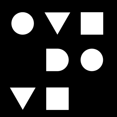
Bridging two unique creative cultures
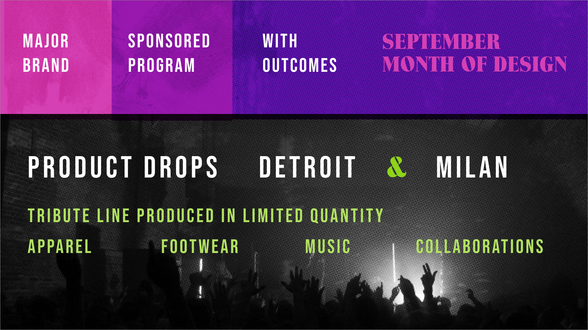
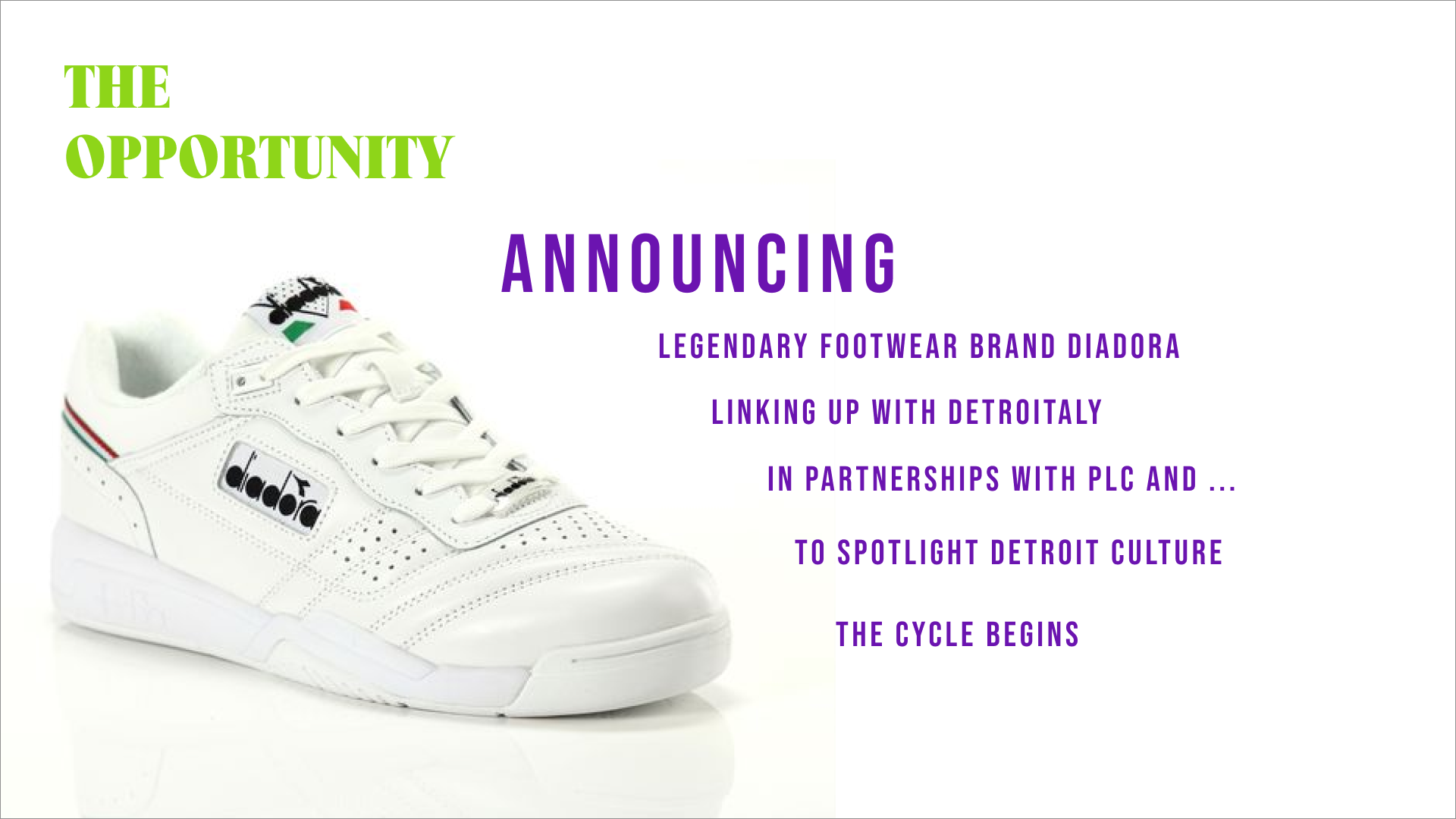
DETROITALY is a production company with a big mission to connect designers from Detroit and Italy to produce unique products and experiences.
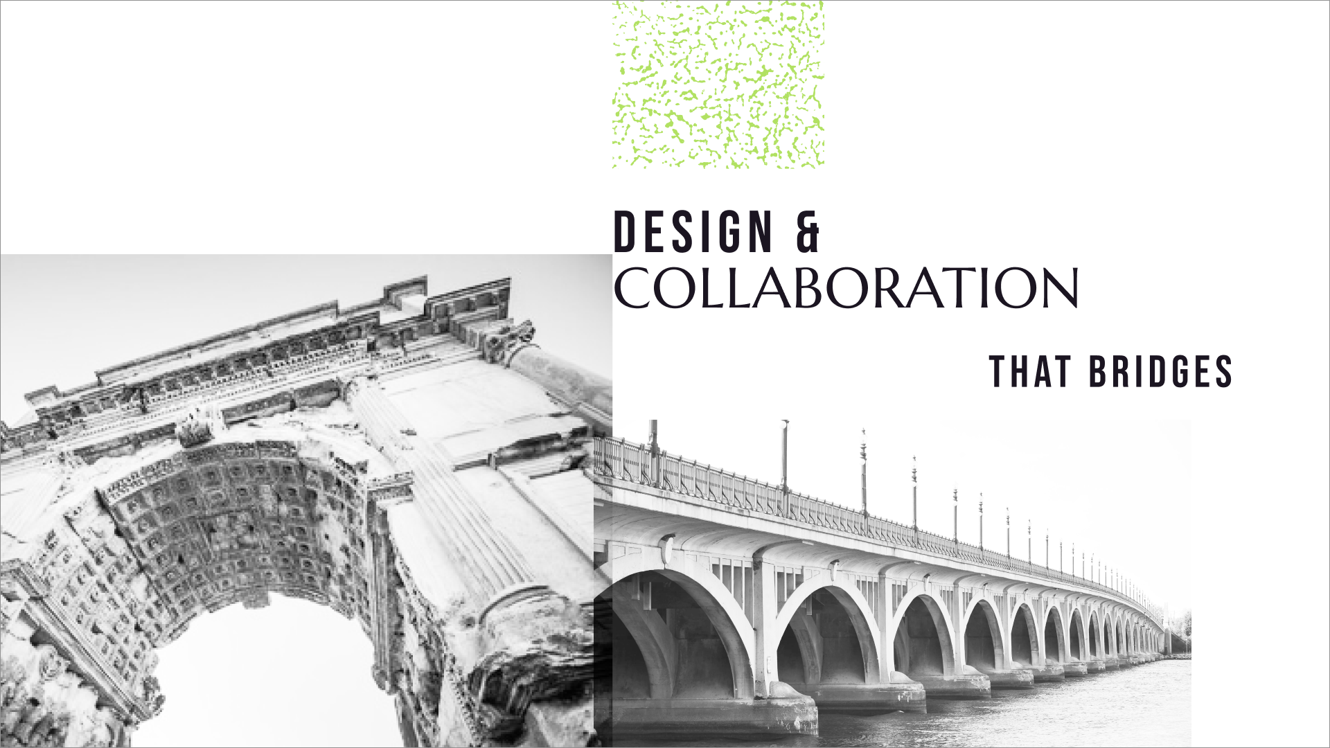
We worked together to establish a brand direction that expressed the process of collaboration and harnessed symbolic imagery from two worlds.
Role
Creative Direction
Delivered
Logotypes, Brand expressions,
pitch content


Logotypes
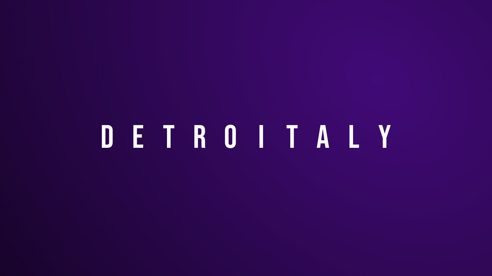
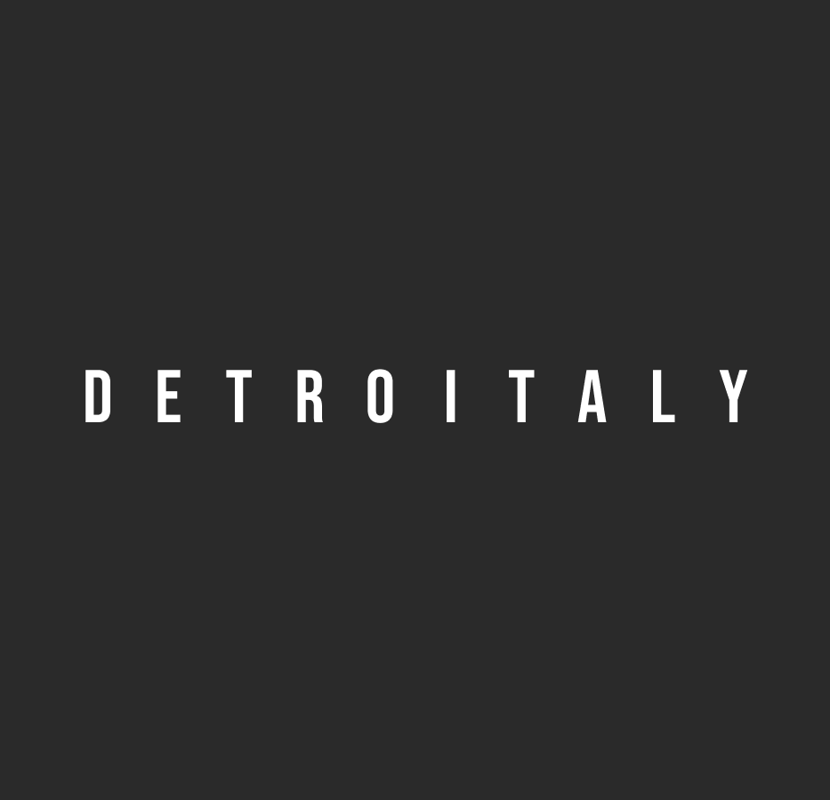
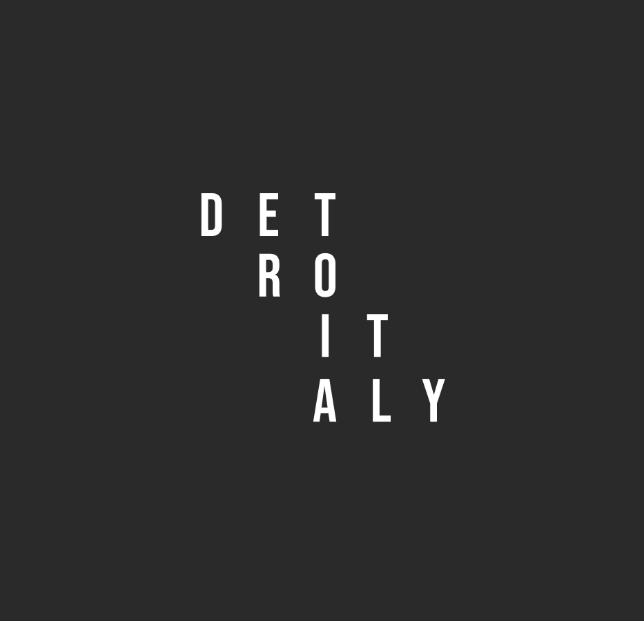
It was important to see DETROITALY as one entity, but still be able to see two unique parts.
The logotype was designed to shift, restructure, and flex based on the context.
The font Bebas Neue was chosen for both its architectual structure and simple letter forms that reference location signage.
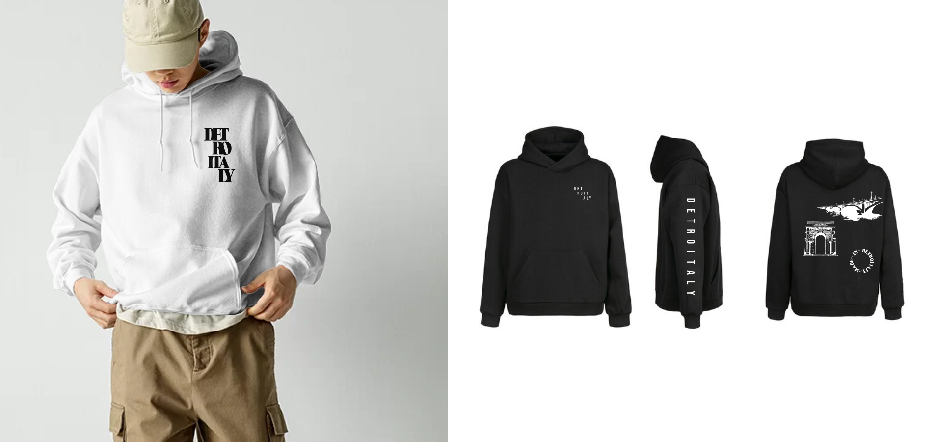
Applying the brand
Branded apparel was an important vehicle to introduce DETROITALY to it’s audience.
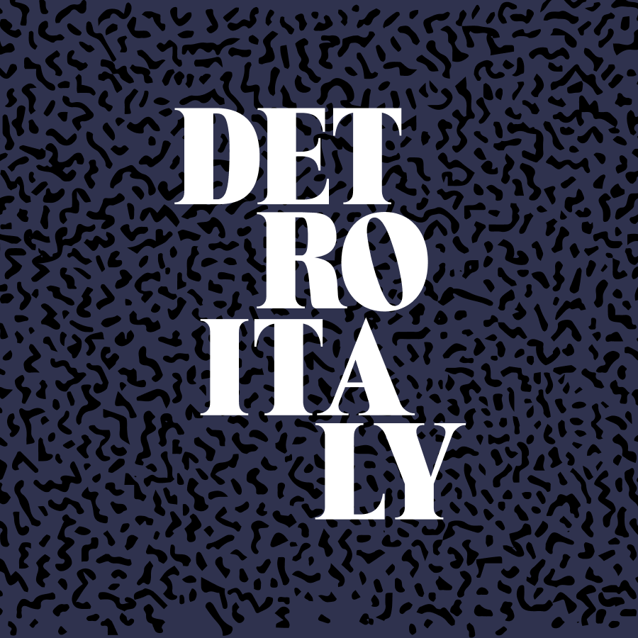
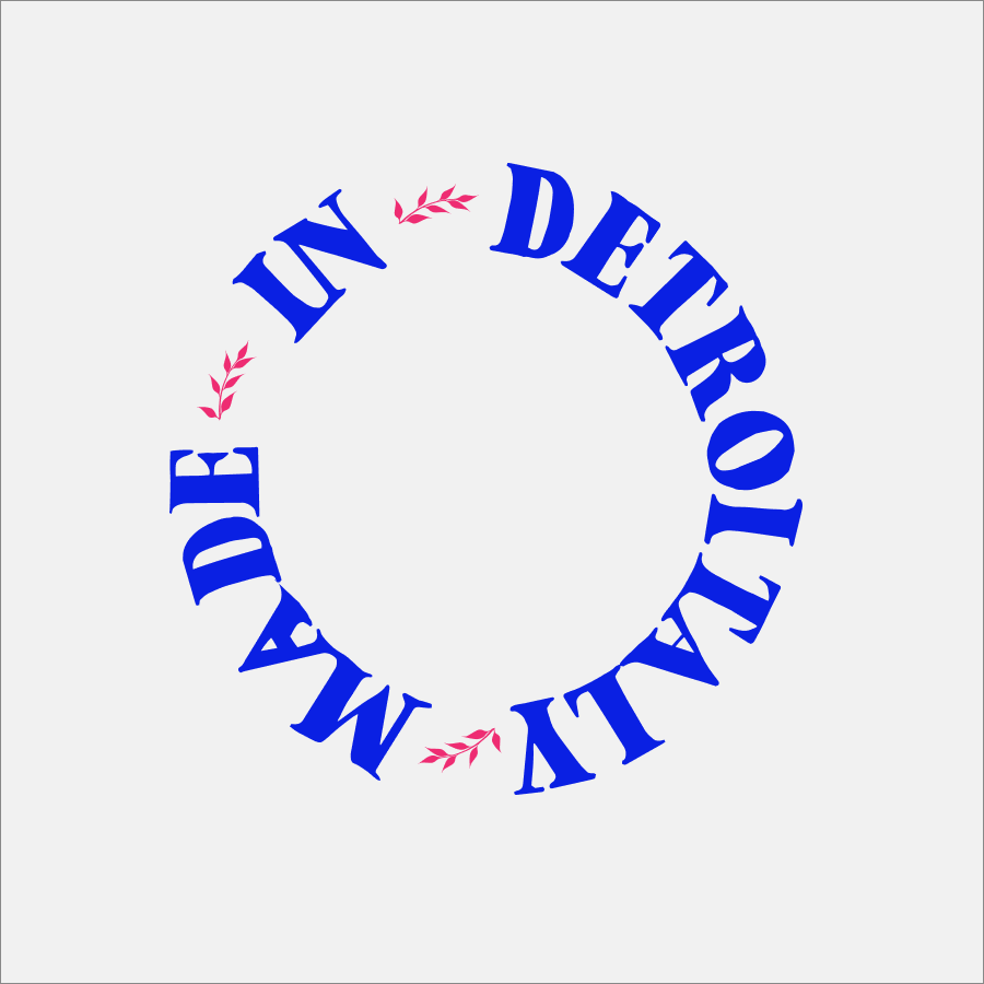

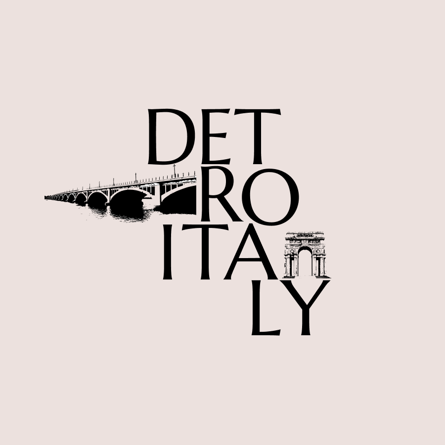
Expressing the brand
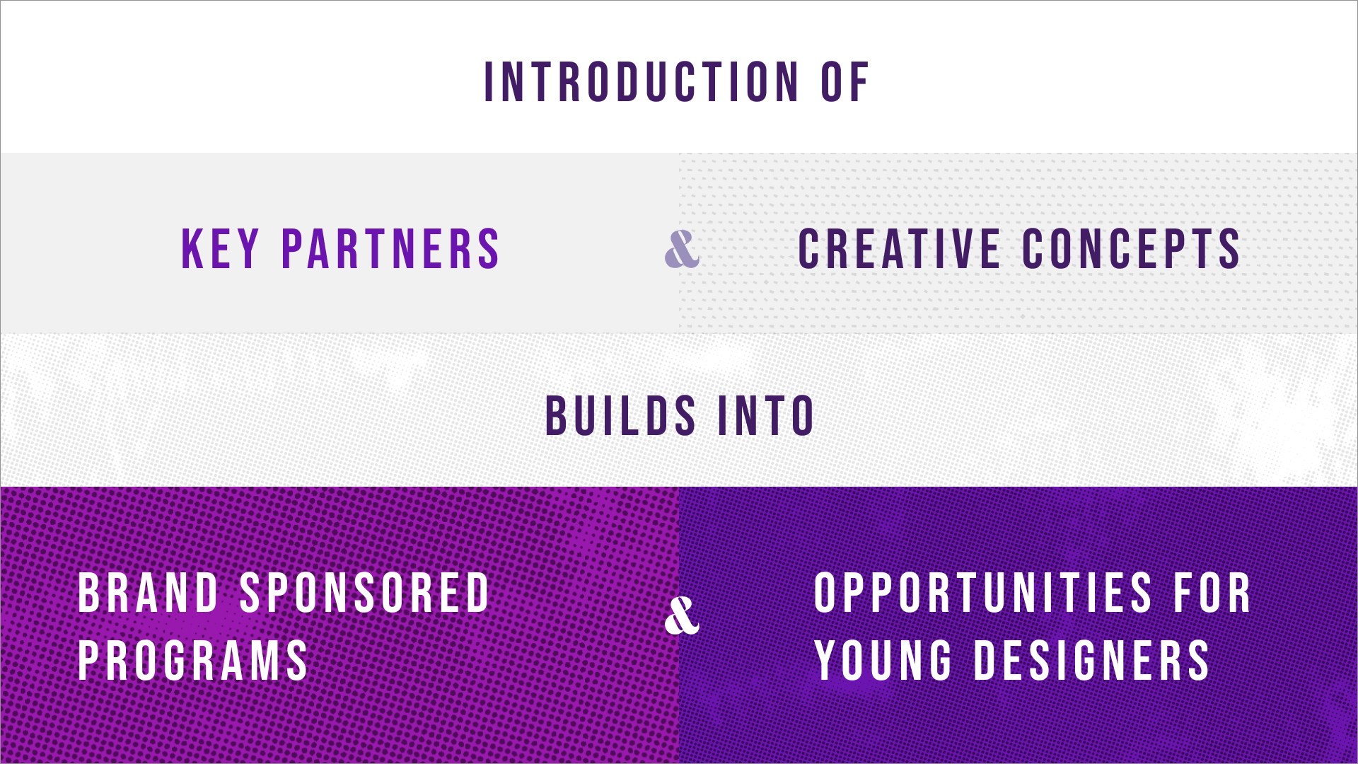
The visual direction of how the brand could be expressed remains flexible to fit the context in where it shows up, but also to support partnerships with other brands.
